Great British Railways flies the flag as logo goes back to the future
PositiveWorld Affairs
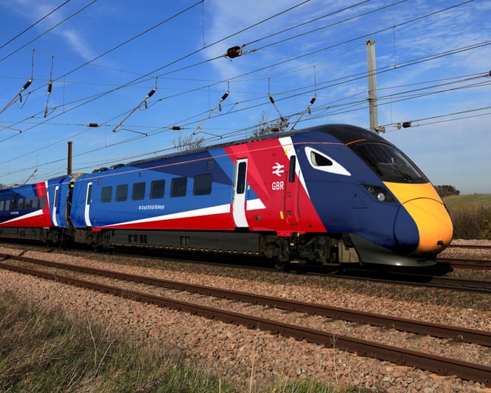
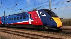
- The logo and branding for the newly renationalised Great British Railways were unveiled at London Bridge, featuring a design that incorporates the traditional red, white, and blue colors along with a familiar double arrow symbol. This marks a significant step in the reform of the railway system in the UK.
- This development is important as it signals a commitment to a more unified national railway identity, potentially enhancing public perception and trust in the service, while also reflecting a cost-effective approach to branding amidst rising train fares.
— via World Pulse Now AI Editorial System